TRANSUNION HACKATHON
TransUnion is a credit reporting agency that strives to use "information for good." For its Second Annual Consumer Interactive Hackathon 2016 in San Luis Obispo, teams were prompted to create a fun and addicting game to educate millennials about the importance of building credit and how purchases affect their credit score. With these constraints and the collaborative efforts of the entire team, Soar & Score was created to tackle this very challenge.
OUTCOME
1st place in the TransUnion hackathon! Developed an iOS application educating millennials on the importance of credit score and establishing financial responsibility.
ROLE
UX & UI Designer
DURATION
24 Hours
PROBLEM:
The entire premise of this Hackathon was to find a way to inform youth about the importance of financial responsibility. When hearing about the participants’ experiences with credit or building credit a good majority barely even knew what a credit score was, or how it was calculated. According to a survey conducted by TransUnion, 32% of millennials were interested in buying a home, but 43% had a “F” credit score, highlighting the importance and relevance of this problem.
OBJECTIVE:
TransUnion wanted teams to create a fun and addicting way to capture users into learning about credit score through an engaging experience. The popularity of mobile games has risen exponentially since inception, and TransUnion believed this was the best medium to communicate and educate this market segment. It was up to the teams to decide the gameplay and experience. What TransUnion found most important was how the game integrated their credit score simulator and educational components.
OUR PROCESS:
Our team began brainstorming a solution by thinking of games we found were most addicting to us. We found games were addicting for two reasons: the gameplay was simple and had no end. With this realization, we also wanted to create a game that taught the user about events and actions that affected their credit score, but in a way that the user felt the game’s main intention was to teach.
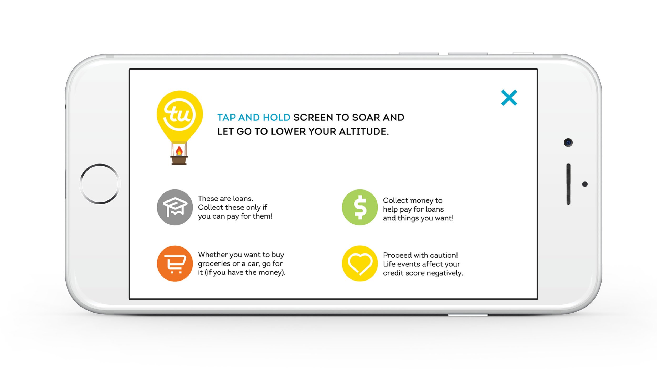
We entertained many ideas, ranging from a “choose your own adventure” game to role playing games. However, after we really defined our constraints we began thinking of an analogy we could use to represent a sort of journey that people taking building up their credit. This analogy took shape as a hot air balloon, experiencing different events that could either help it stay afloat or lose altitude.
FINAL PRODUCT
By the end of the 24 hour period our team was able to create a fully working prototype to show the judges for our final presentation. Our team used the style library of all the TransUnion colors, typography, and icons that we were given and incorporated it into the final design of the app. Above are the final screens for the mobile app that we created.


